About Hamonsoft
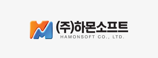
CI
Corporate Identity
Hamonsoft’s CI is expression of harmony, value rise.
Hamonsoft’s CI is consist of initials of each alphabet, H and M, are formed in harmony by maintaining the independent form,
Orange means unending challenge and enthusiasm, and blue means developmental change and innovation.
The shape of the rising curve in the middle between the letters H and M is reflected in value of customers and Hamonsoft through customer satisfaction and technological innovation.
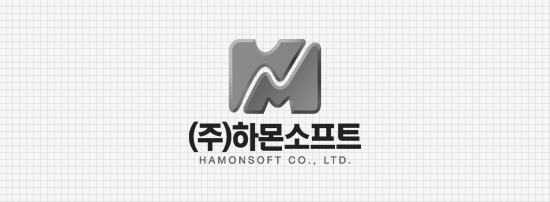
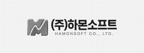
Logo system
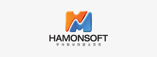

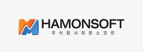
English, Vertical and Horizontal
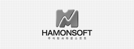
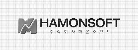
Korean, Vertical and Horizontal